Brand Identity for Edoardo Marcucci
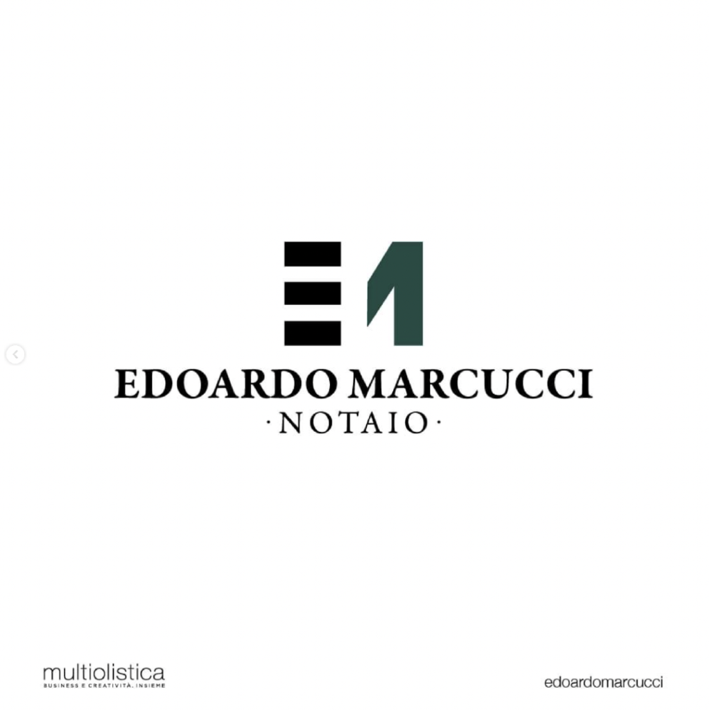

We were chosen to create the 𝑏𝑟𝑎𝑛𝑑 𝑖𝑑𝑒𝑛𝑡𝑖𝑡𝑦 of the Notary 𝐄𝐝𝐨𝐚𝐫𝐝𝐨 𝐌𝐚𝐫𝐜𝐮𝐜𝐜𝐢.
The logo created is a 𝑚𝑜𝑛𝑜𝑔𝑟𝑎𝑚 formed by the letters 𝐄 and the 𝐌, with a sign that communicates a solid and young identity at the same time.
The font used is ɢᴀʀᴀᴍᴏɴᴅ, one of the most iconic and refined characters in history. As colours we chose black and green which represent elegance and balance.